Eye-Catching Ad Design: How to Stand Out from the Crowd
Craft standout ads, convey brand messages, captivate audience, boost conversions.

With ever-increasing levels of automation in the form of black-box campaign types (yes you, Performance Max), smart bidding, and broad match; the importance of refined ad targeting is fading.
Meanwhile, the death of third-party cookies will make it more difficult for advertisers to do what they have done for years - pinpoint ads to targeted audiences. We have no option but to embrace these changes and shift our focus to an old cornerstone - ad creative.
Specifically, how do we create eye-catching ads that stand out from the competition, communicate key brand messages, and appeal to the right audience? And of course we can’t forget another fundamental - encourage prospects to convert.
In this blog, we’ll highlight ads that fulfil these aims and share actionable insights into how your brand can do the same.
Attention Grabbing Search Ads
The importance of a well-crafted and eye-catching text ad is often overlooked but the truth is, these ads need to stand out from others in the search engine results page (SERP) in order to encourage users to engage.
Before we delve into some scroll-stopping examples, it’s important to first consider the anatomy of a search ad.

As you can see above, search ads can include:
- Headlines
- Descriptions
- Display/destination URL
- Paths
- Callout Assets
- Sitelink Assets
Ads can also include a number of other assets (formerly extensions) including image, structured snippets, call, and location. All ad elements should be carefully considered, follow Google guidelines, and optimised in line with best practice.
Click Worthy Ad Copy
Responsive Search Ads (RSA’s) give advertisers a great deal of flexibility. With 15 headlines and 4 descriptions available there’s plenty of room to add in feature and benefit-driven ad copy that perfectly encapsulates your brand, whilst also leaving space to test multiple call-to-actions.
When crafted correctly RSA’s can also serve tailored ad copy by dynamically adapting to every search and inserting keywords or phrases from a user's query.

In this ad from West Cork Coffee, it appears the advertiser has used Dynamic Keyword Insertion (DKI) to facilitate updating the headline to match the query for “coffee subscription”. This makes the ad a lot more relevant to the user, and is a proven way to improve ad click-through rates and Google Ad quality score.
Pact Coffee goes a step further by not only featuring a headline that matches the user’s query, but by also incorporating an offer into one of their headline spaces and a promo extension to highlight the discount again.

We only need to look at our in-store shopping habits to understand the powerful lure of discounts. This psychology translates seamlessly to online. Offering a discount not only halts users in their digital tracks, prompting them to click, but also creates a sense of immediacy. Customers feel compelled to act swiftly to snag that deal. The result is an attention-grabbing ad that encourages customers to act.
Google Ads can be highly competitive and it’s common practice to run ads against other companies by targeting their keywords in competing campaigns.
Strategies in the CRM & Work Management Software War
Consider the instances where we searched Capsule CRM and the work management system, Asana. When users make such specific searches, it’s evident they have a clear idea of what they’re after. Competitors need to steal our attention and highlight what makes them the superior option. Equally, the brands being searched need to stand out from these competitors to secure the user’s click.


Hubspot, renowned as a leading CRM solution especially for small enterprises, draws attention in its ad by emphasising its free tier. Meanwhile, SugarCRM’s headline, “It’s Actually Easy To Use” capitalises on a frequent paint point in the CRM world (and interestingly, a Capsule CRM selling point) - user-friendliness. The word “actually” cleverly appeals to users searching for a hassle-free solution.
Capsule itself meanwhile has smartly added “Official Website” to its headline, reinforcing its standing as the brand being searched.
In the Asana example, Monday.com has been, shall we say, aggressive in their approach. It’s a strategy that while we don’t have access to the data, we reckon at least steals a substantial amount of traffic from Asana’s hands.
The post-click experience is equally important here and in this case, the landing page for Monday.com features comparisons to not only Asana, but other work management tools. Any bets on whether their running ads against these competitors too?

Scroll-Stopping Display Ads
The relative low cost, wide reach, and visual nature of display ads make them a key part of any top-of-funnel marketing strategy. However, given users are bombarded with banner ads across websites and social media everyday, it’s crucial to make your ads memorable.
Rich Media + Animated Ads
A 2022 Creatopy study identified that 63% of over 3 million ads observed were animated. We’re not surprised, as animated ads engage a user and capture their attention more so than their static image counterparts. They also allow you to convey more of your brand's personality and serve more information.
Brands wanting to make a real impact can use HTML5 creatives to serve eye-catching rich media ads. This modern and dynamic ad format features multimedia elements like animations, image galleries, games, and video to encourage interaction from users.

Another big benefit is that rich media banners can be programmed to expand as you roll over, taking up more screen real estate to serve an immersive and memorable experience.
Rich media ads are proven to be highly effective with 267% higher click-through rates than standard banner ads and an engagement rate of 16.54% vs 2.14% standard ads.
In addition to the visual benefits of HTML5 ads, they also come with advanced measurement capabilities that let advertisers more accurately determine the effectiveness of their campaigns. Some of the actions we can get insights on include:
- Rich Media Expansions - the number of times an expandable ad is expanded by users.
- Rich Media full-screen impressions - the amount of times an ad is opened in full-screen mode.
- Rich Media interactive impressions - the number of impressions that occurred when a user interacted with the ad via expanding, mousing over for >1 second, views in full-screen mode, or clicks an exit link.
This combination of dynamic ad elements and in-depth measurement makes rich media ads an effective tool for combating the banner blindness that many of us experience.
The downside is HTML5 ads take a lot more planning, organisation, and creative thought than a standard display ad but brands willing to invest are likely to receive a greater ROI if they leverage the technology effectively.
Bright Colours & Contrast
Apple’s iconic all-white colour palette is instantly recognisable and a hallmark of their brand. However, they’re Apple. They don’t necessarily need to fight for our attention. Yet, their ingenious designs, like this one employing emojis in place of text, ensure they always do.


Get the latest insights to your inbox!
Many other brands lean into vibrant colours and stark contrasts to capture viewers' attention. Mailchimp, known for their banana yellow colour scheme, are masters at leveraging bold and bright backgrounds to make their ads pop.
Bold and contrast-heavy designs are especially important for smaller ad formats as advertisers have less real-estate to make an impression.
While most of their advertising focuses on their brand colour, Mailchimp have been savvy and woven new hues into their latest scroll-stopping social media campaigns.

Yet, the banana yellow always features in some capacity, be it on a t-shirt, mousepad, or a product image. This recurring motif serves as a continual reminder of the brand’s identity, a vital consideration given display and social media ads primarily aim to bolster brand awareness.
Testing, testing, testing.
Arguably, the most important thing to remember about display advertising is the importance of continuous testing. It’s through a/b testing elements like call-to-actions, colours, and design aesthetics that we discern what works best for audiences in terms of capturing their attention, and driving conversions.
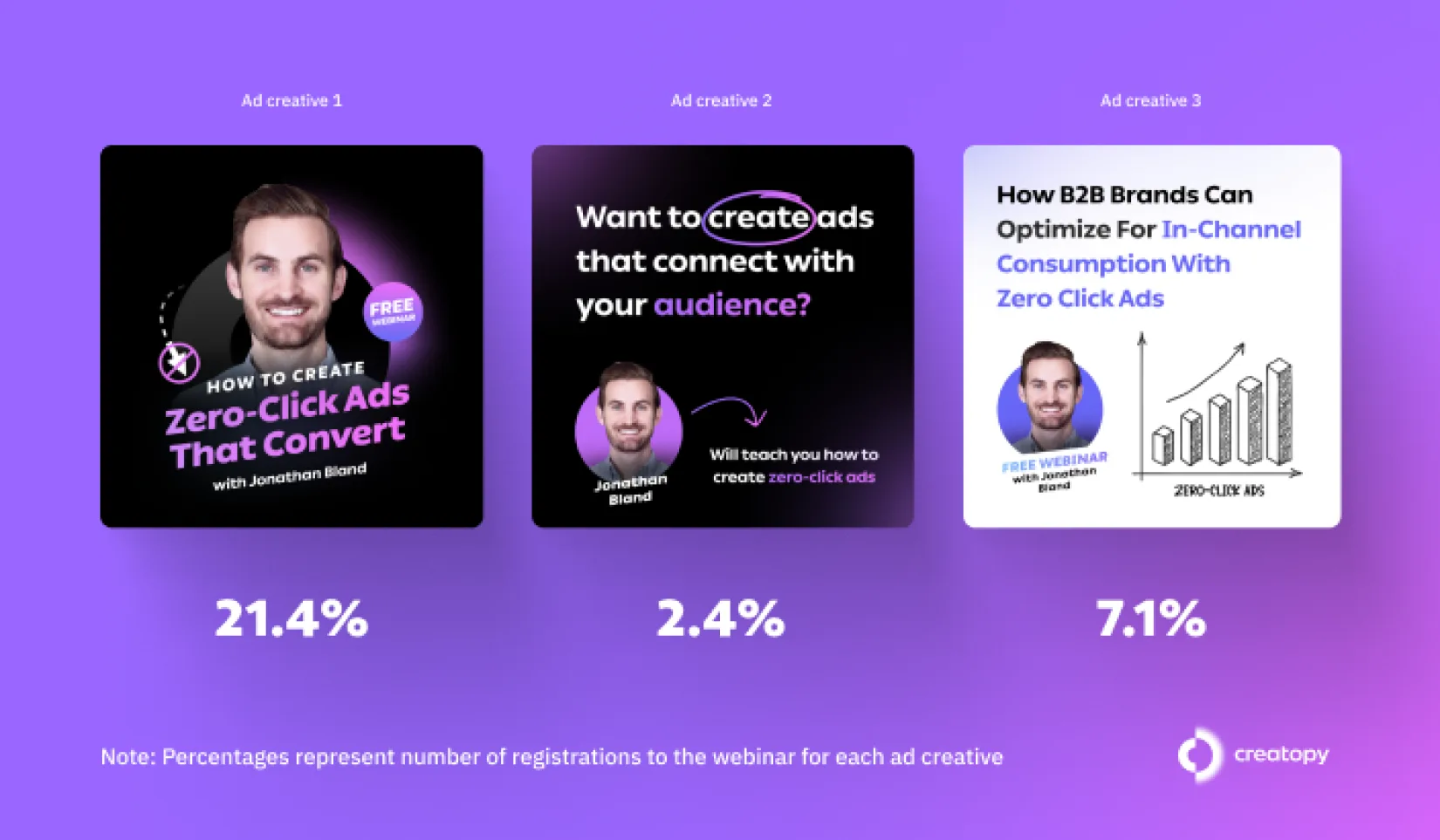
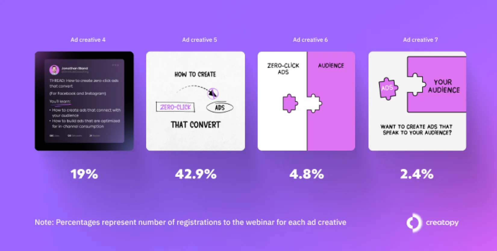
Take this study from Creatopy that references a test conducted for promoting one of their webinars. The first 3 ads are atypical of ads promoting a webinar, while the next four creatives are a bit more disruptive and unconventional - it’s not immediately obvious what these ads are promoting.


The results were enlightening. The more unconventional ad sets had the higher click-through rates and one of them, ad creative 5, was responsible for 42.9% of overall webinar registrations.
However, the winner in terms of conversion rate i.e. the number of registrations divided by the number of clicks received was ad 1. This observation is significant, as while ad creative 1 didn’t engage wider users as much as the unconventional ads, it clearly did the better job of pre-qualifying the audience and securing the right clicks.
This brings us to a pivotal point: while it’s essential for ads to stand out, it’s paramount that they resonate with the right audience. In the GDPR era, where targeting poses its challenges, ad creatives are now just a showcase of brand identity but they are also becoming increasingly crucial in targeting the appropriate audience effectively.
Let Our Experts Make Your Ads Pop
Do you need help making your brand's ads pop? Eyekiller have expert strategists and creative designers on hand to help you achieve the best results. Fire us an email to get started.


