
Blog
Why your SaaS homepage isn't converting
Hear from Lucy on why most SaaS homepages don't convert, and how to fix yours.
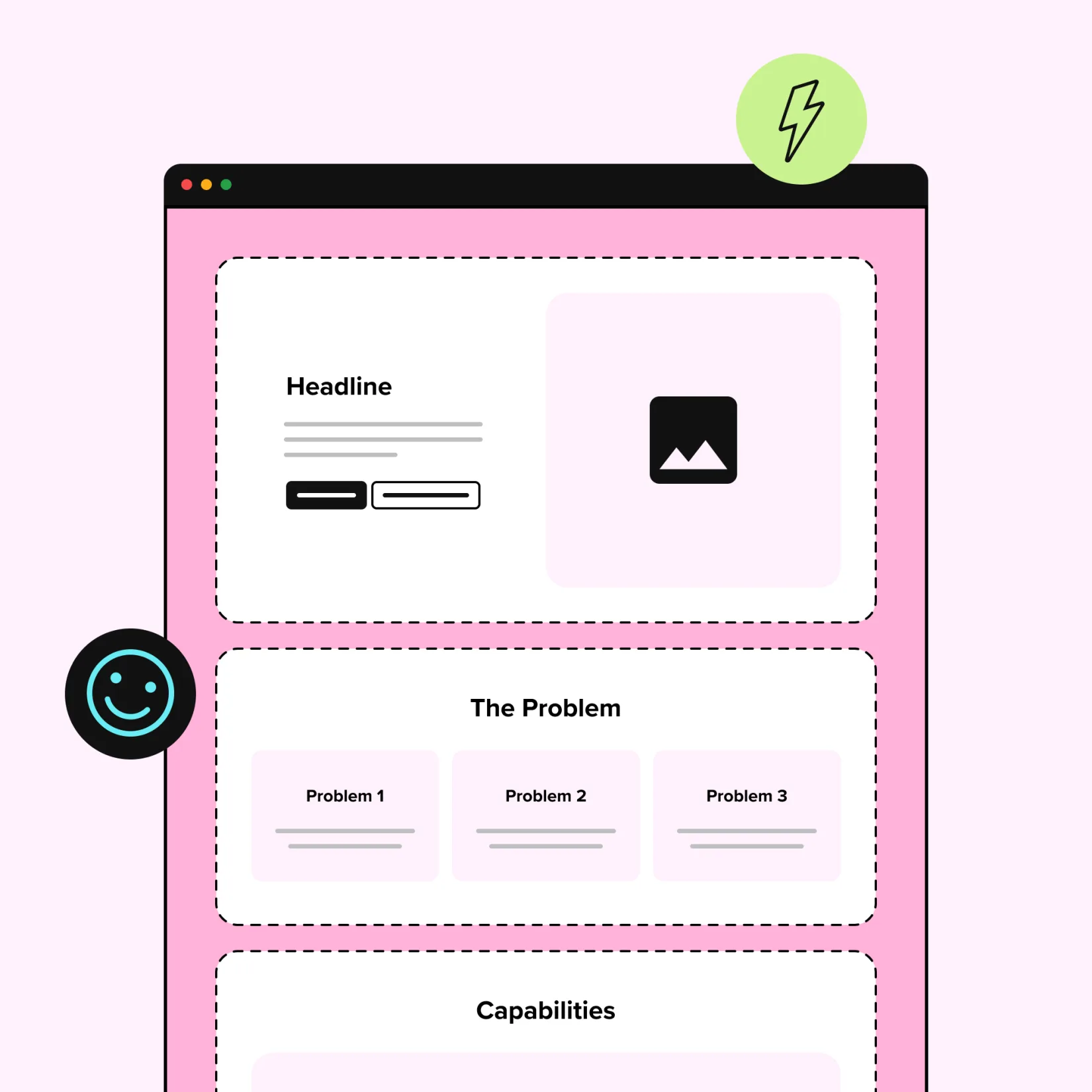
The Essential Blocks of a SaaS Homepage
Before a single block is designed, we need to understand exactly who we're designing it for. If your homepage isn't speaking directly to a visitor's situation, they'll find a competitor who does.
That starts with defining your Ideal Customer Profile (ICP). Get clear on who they are, what their role involves, how they currently handle the problems your product solves, and where the friction is. Once you have that picture, every block on your homepage can be framed around their specific situation, language, and motivation. Without it, you're guessing.
Here are the essential homepage blocks, ordered by the psychological journey a first-time visitor takes from the moment they land to the moment they convert.
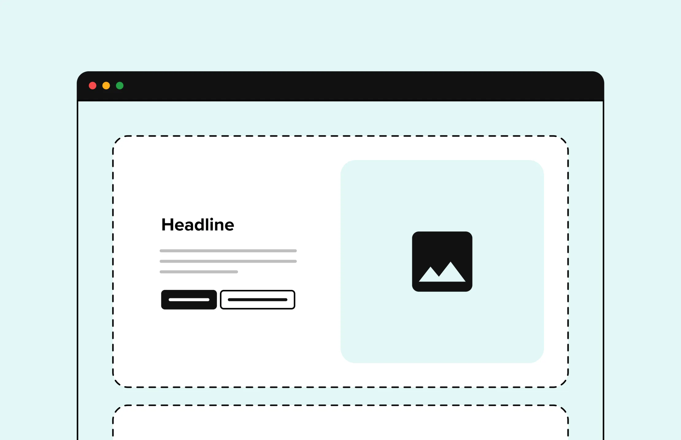
1. Hero: Make the Promise Clear
This is the most important block on your homepage as you have just milliseconds before a new visitor decides whether to keep reading or leave.
Google’s research found some users form opinions within 17 milliseconds while most need about 50 milliseconds.
The hero needs to immediately communicate: this is for you, and here's what you'll get. Therefore, a strong hero includes:
- Outcome-led headline: Lead with what they get, not what you do. "Collaborative task management software" doesn’t sell, whereas "Ship projects on time without chasing your team for updates" speaks directly to a felt pain. If your heading could apply to other SaaS products in the market, rewrite it and focus on defining your differentiator.
- Clear company description: Once the headline has made a bold promise, the subheading has to close the ambiguity gap. In a sentence or two, clearly tell the visitor exactly what you offer and how it delivers the outcome above.
- Trust signals: A review badge, recognisable customer logos, and bold statistics answers "can I trust this?"
- Primary CTA: The one action you most want them to take: sign up, start a trial, book a demo.
- Secondary CTA: For visitors not ready to commit yet, "See how it works" or "Watch a 2-min overview" helps them to move forward in their journey, instead of bouncing.
- Simplified product visual: Not a complex screenshot, just enough to show the real product through key UI elements. Motion helps significantly to communicate how the product behaves.
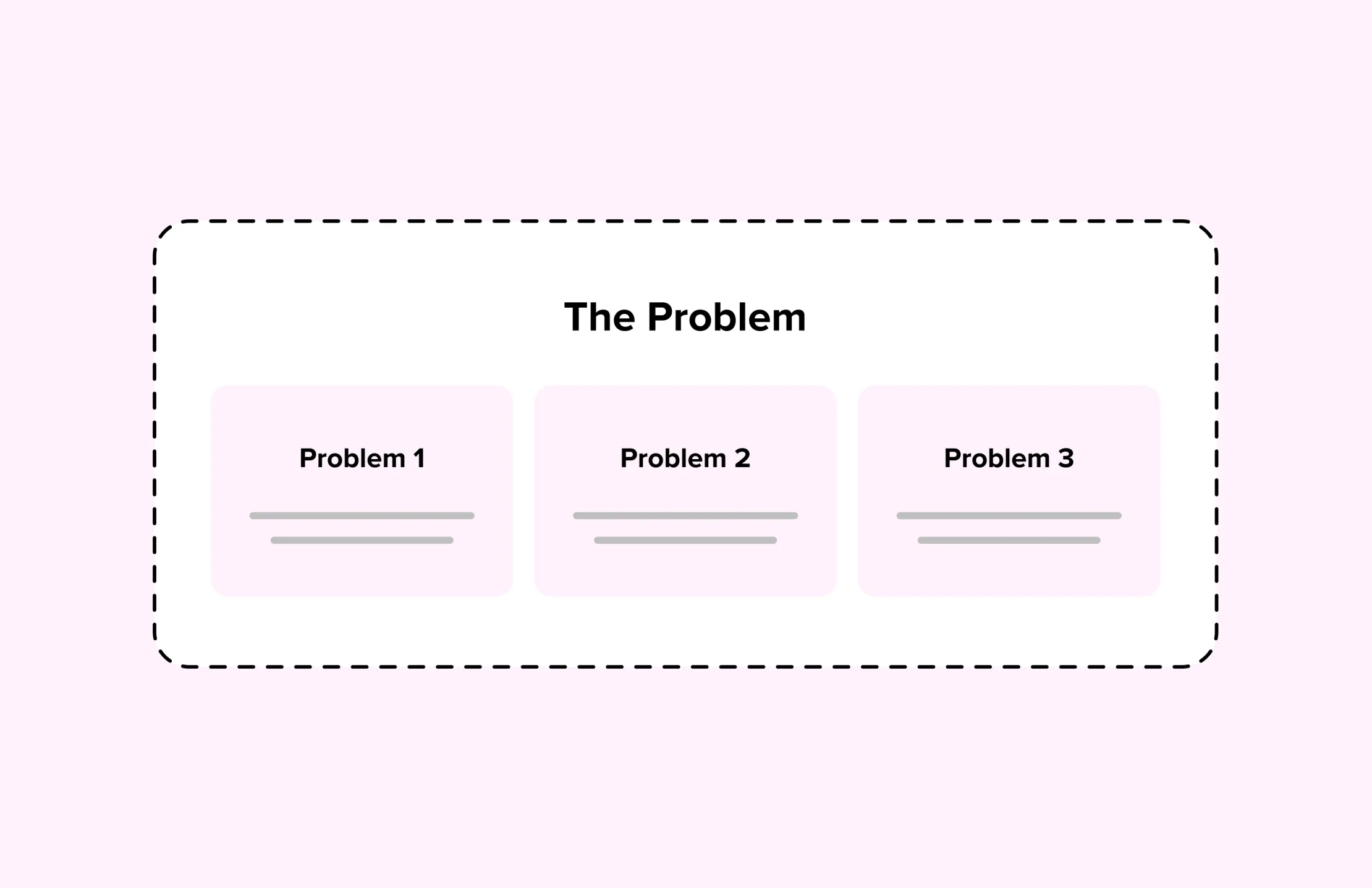
2. Self-Identification: Make Them Feel Seen
The goal is to make your visitor think: "they understand exactly what I'm dealing with." The most effective format for this is problem-solution mapping. Pair up to 3 specific pain points your ICP experiences with the direct way your product solves it.
Done well, this creates the scroll momentum that carries someone through the rest of the page. Often it can be useful to show the old-vs-new-way comparison to visualise this further.
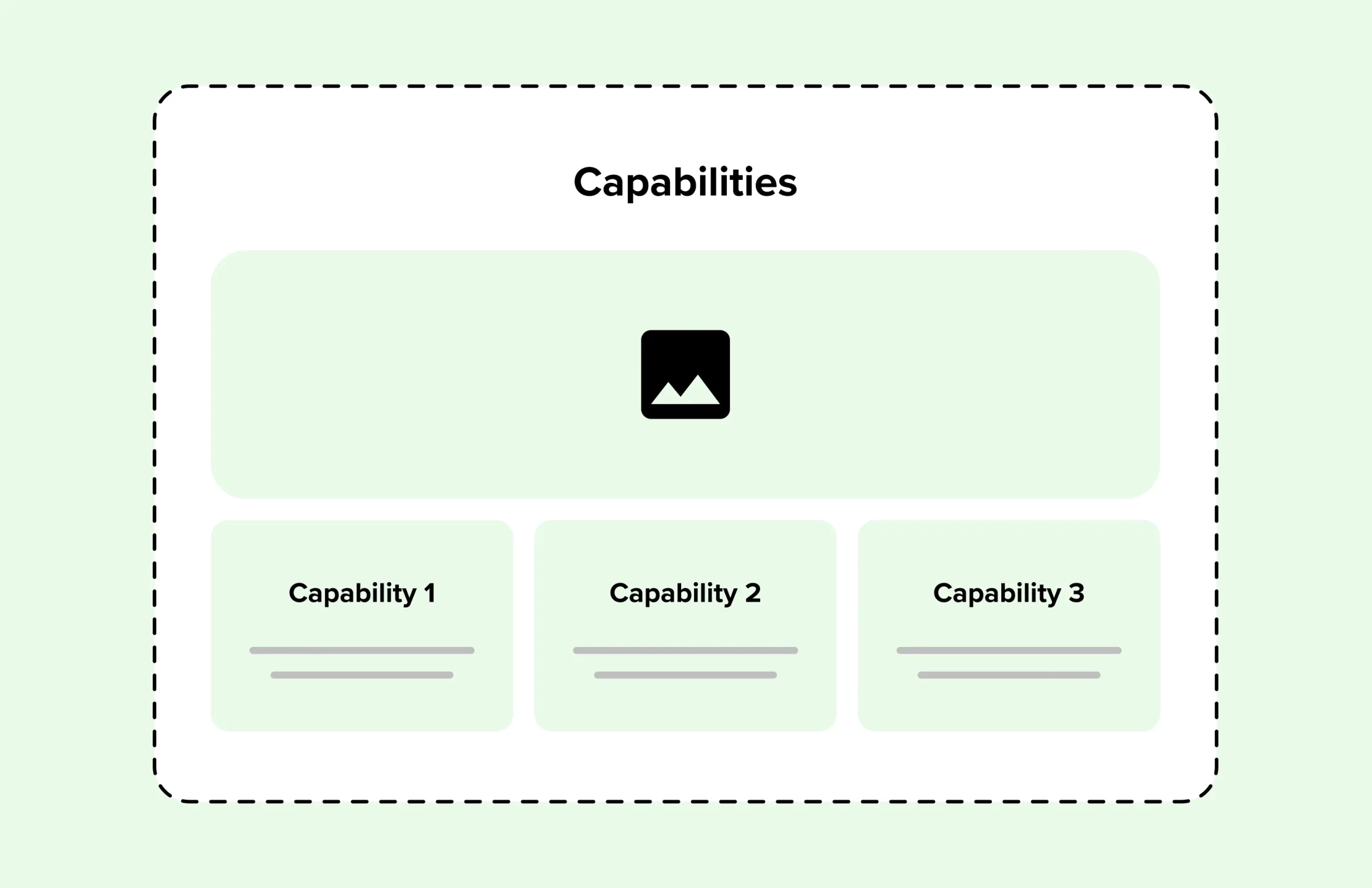
3. Capability Set: Outcomes, Not Features
Not a feature dump, each capability should be anchored to what it does for the user.
- Pick three to six capabilities maximum: Choose the ones that directly address your ICP's biggest pain points, not your team's favourite features.
- Use your ICP's language: The words your customers use in sales calls, support tickets, and reviews are almost always more relatable than internal product terminology.
- Pair copy with product visuals: A contextual screenshot or subtle animation showing the feature in use removes doubt that copy alone can't.
This section moves a prospect from "interesting" to "this could actually work for us."
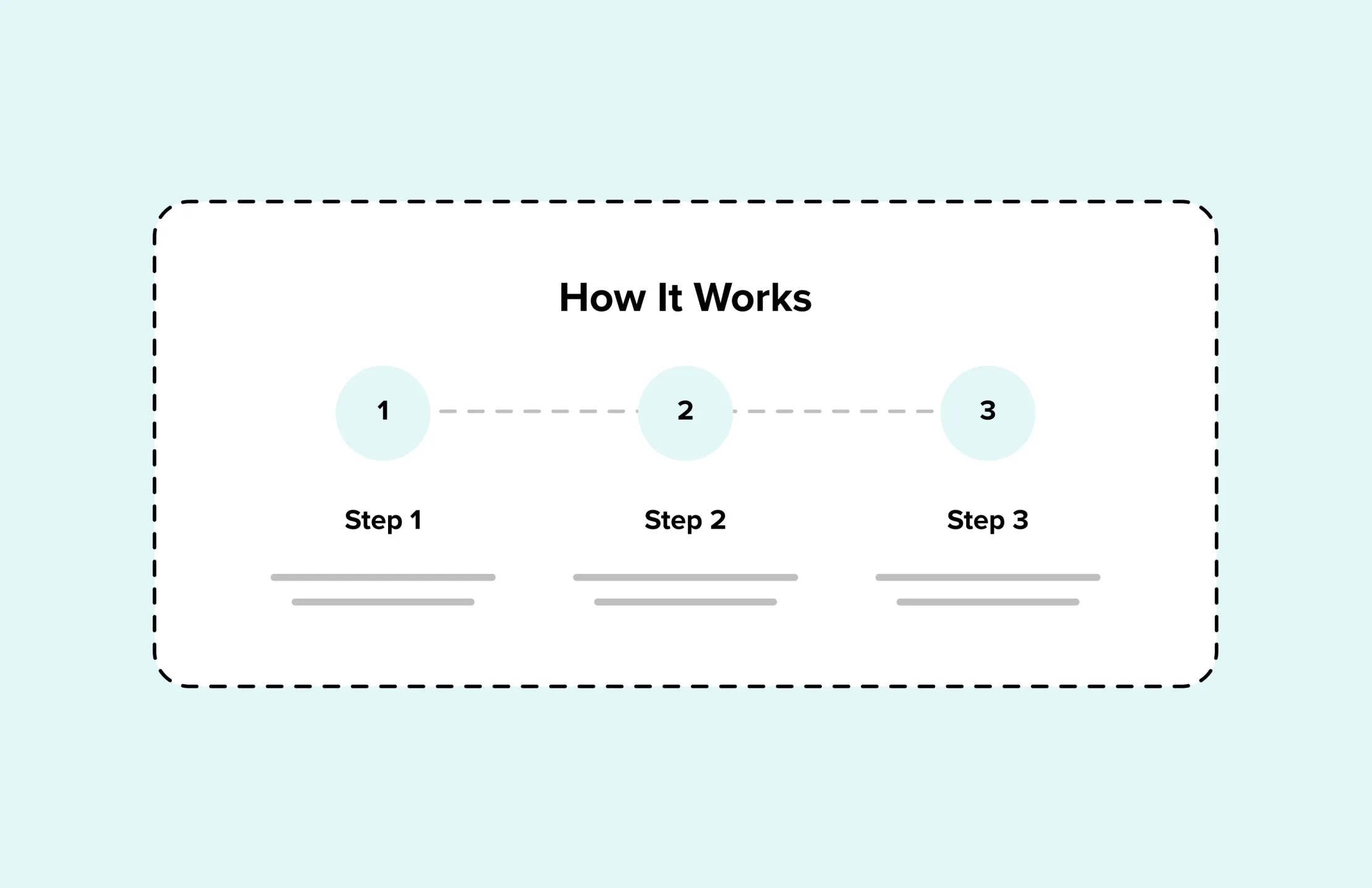
4. How It Works: Eliminate Hesitation
Interest without confidence doesn't convert. A visitor can believe your product solves their problem and still hesitate, perhaps wondering how long the setup takes, who else needs to be involved, and what happens if it doesn't work out.
Three to four clear steps showing the journey from signup to first value removes that doubt and perceived effort. Also consider a short platform walkthrough or video explainer compressing the entire onboarding question into 60–90 seconds.
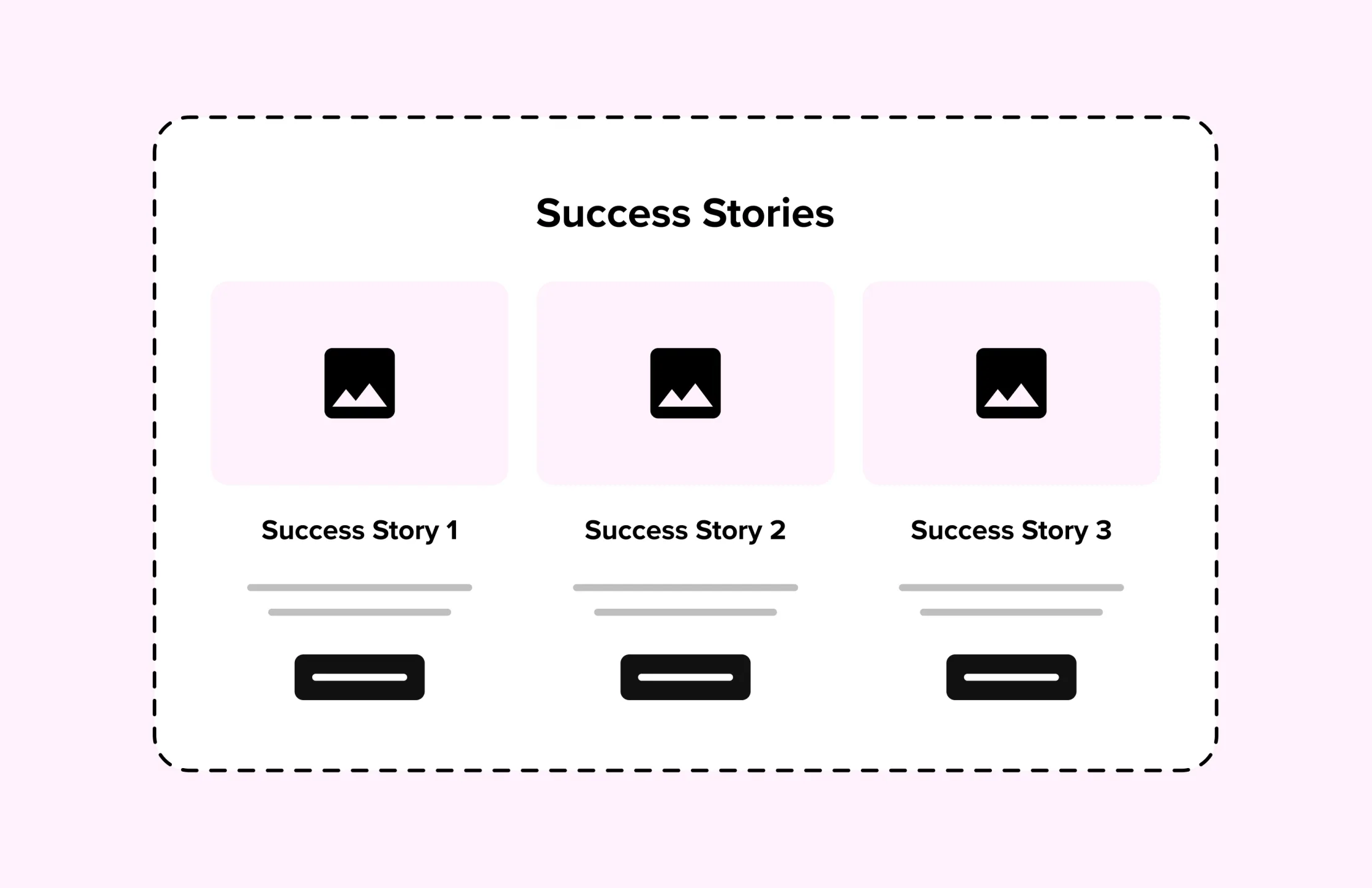
5. Proof: Build Credibility Throughout
Now your visitor needs evidence that your product delivers for people like them.
Case studies are the most effective proof format because they follow a narrative a prospect can project themselves into: here's the problem, solution, and outcome. Where possible, include details that aid self-identification (industry, company size, role) so a visitor can find a story that mirrors their own situation and think "if it worked for them, it could work for us."
Strengthen these case studies further by:
- Leading with the outcome: "40% reduction in onboarding time" in the heading earns the click, the case study then justifies it.
- Pairing with direct testimonials: A customer saying it in their own words carries more trust. Keep quotes specific ("we cut our reporting from 3 days to 3 hours"), as vague praise ("great product, great team") is forgettable.
- Distribute proof: Trust signals should be placed throughout the page to catch any moment of hesitation.
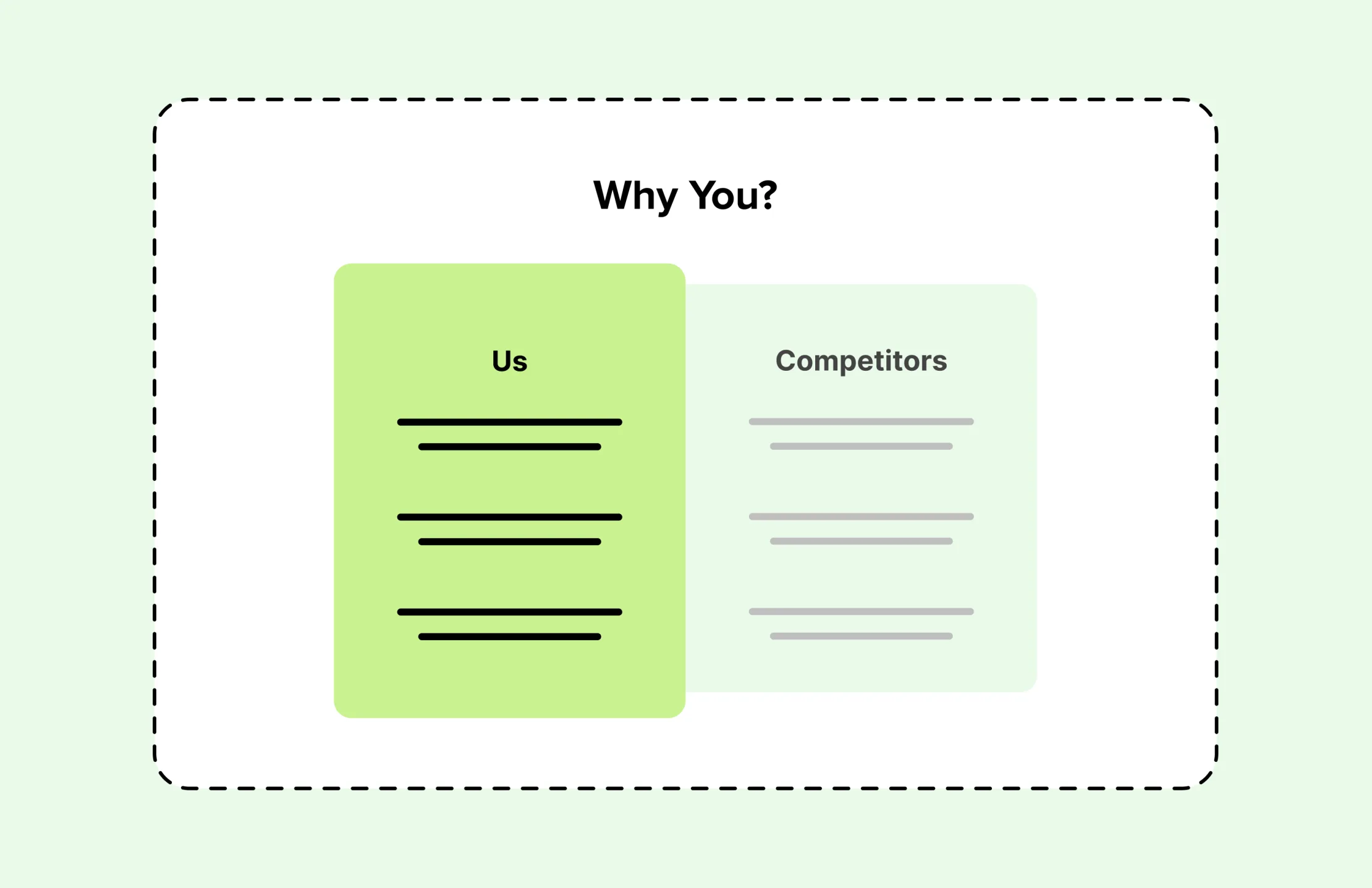
6. Why You?: Define Your Differentiator
By this point a genuinely interested visitor is also looking at your competitors. They likely have multiple tabs open and are building a shortlist, so your website’s job is to make the comparison easy.
Effective formats for this in SaaS:
- Comparison tables: Pit yourself directly against named competitors or the category convention ("most tools do X, we do Y instead"). Be honest, a table that gives competitors ticks on everything reads as untrustworthy so pick the dimensions where you genuinely win and own them.
- Positioning statements: A confident paragraph that articulates who you're built for and what you've deliberately chosen not to be. This works especially well for newer products competing against established incumbents,"built for lean ops teams who don't need enterprise complexity" tells the right buyer they've found their product.
- Card grids: A set of bold reasons and short supporting lines gives visitors a fast scannable summary of your advantages without requiring them to read much. Works well for differentiators that are harder to quantify such as support quality, implementation speed, ease of use.
Whichever format you use, ensure your advantages are unique and specific.
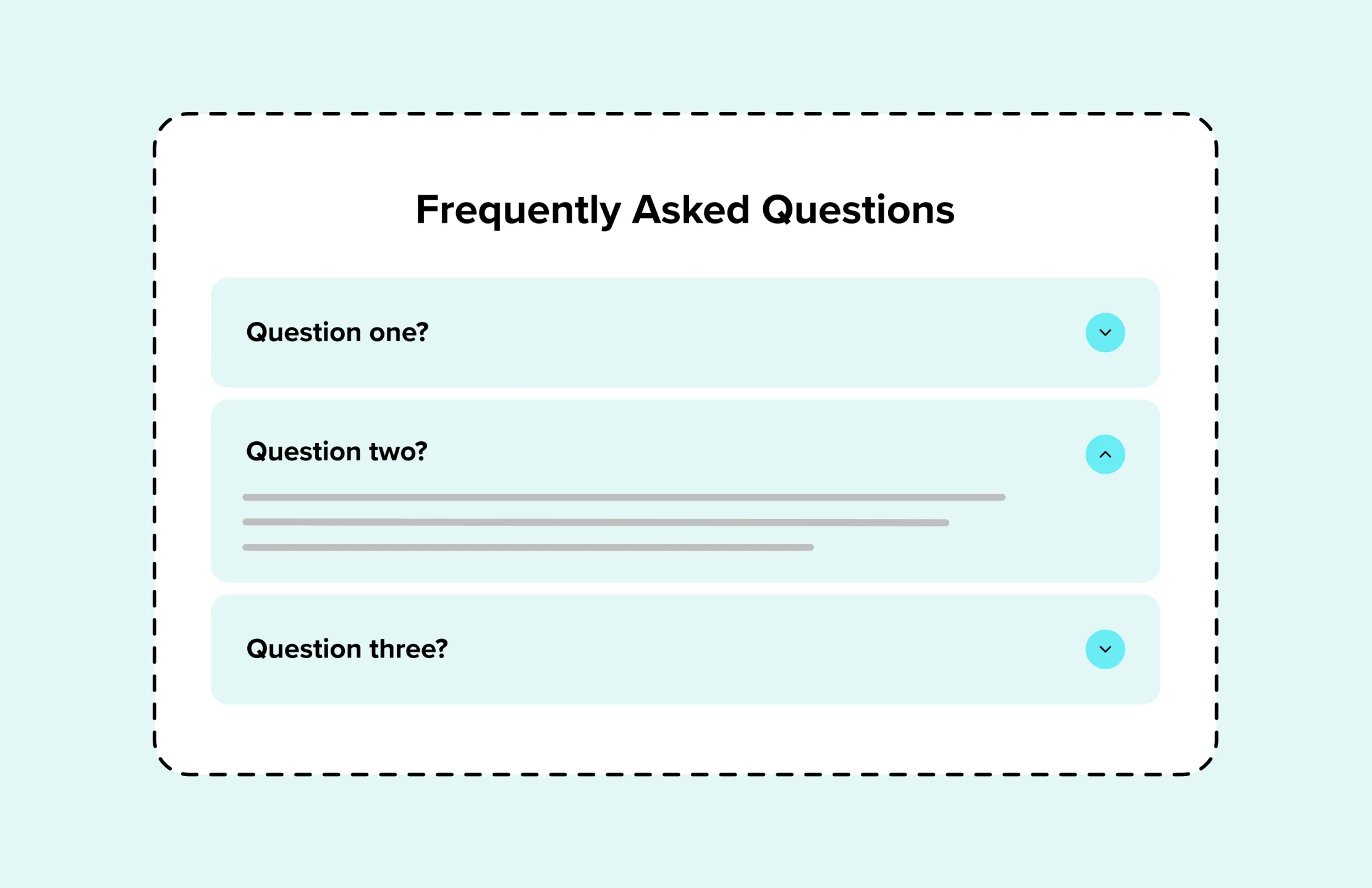
7. FAQs: Remove the Final Objections
By the time a visitor reaches this block, they're close. FAQs exist to clear the last remaining doubts without requiring a discovery call to do it.
Good FAQ content for SaaS typically covers pricing and contract flexibility, onboarding and setup time, integrations, security and compliance, and support availability. Consider what your sales teams repeatedly have to answer.
FAQs have also become one of the most valuable SEO assets as AI search tools increasingly surface direct question-and-answer content in results. This is effective when written in the language your buyers actually search ("how long does onboarding take", "does it integrate with Salesforce", "is there a free trial").
8. Final CTA: Close The Loop
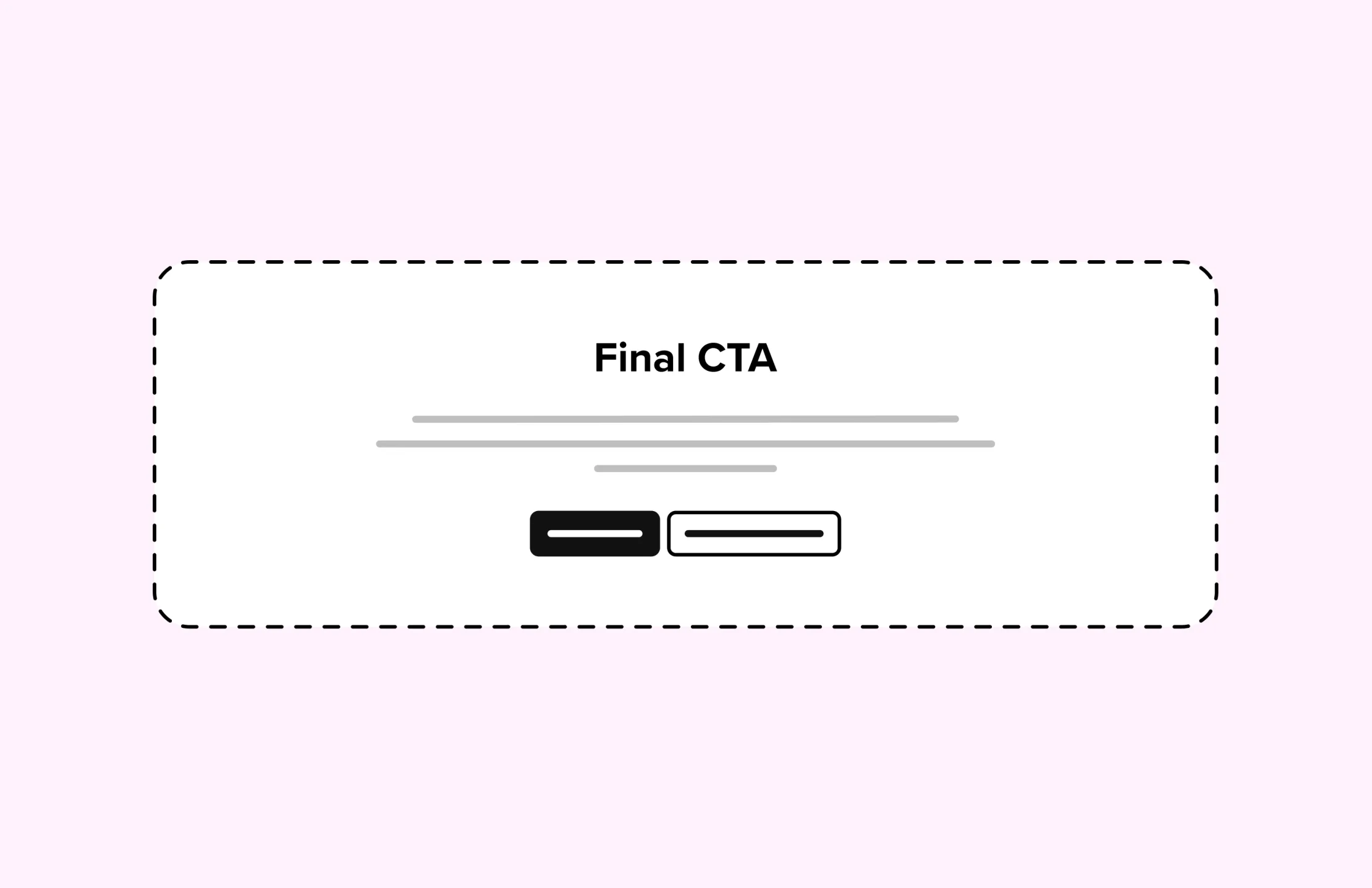
After all the evidence has been laid out, a dedicated call-to-action makes it easy to take action. Echo the promise made in the hero so the page feels intentional, then make the next step as frictionless as possible. The lower the commitment, the higher the conversion.
Does your SaaS homepage follow this structure?
At Eyekiller, we start every SaaS website project with a UX audit: reviewing your current homepage against your actual ICP, identifying where visitors are dropping off, and mapping out what needs to change and why.
Let's chat