Blog
The Power of Subtle Website Animation
Why we turn down more animation than we build, and why that's the whole point.
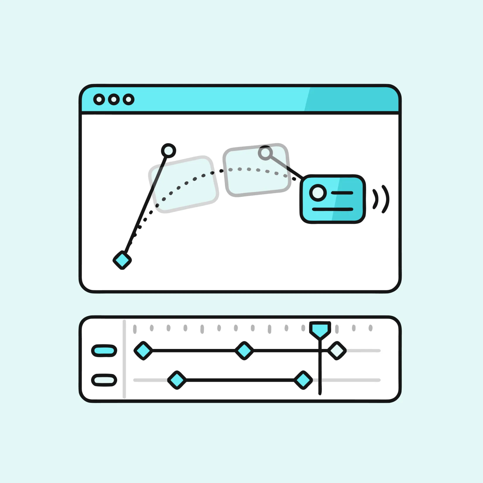
There's a moment in almost every project. Someone sees the design and says "Can we make this pop?"
It's a good instinct, who doesn't love something exciting on their screen? A page that reacts to you feels alive in a way that a static one could never, and when a site is done well, that liveliness is part of why it feels expensive, polished and considered. So you'd think a team that builds websites for their customers would jump at every chance to add more of it.
We don't. If anything, a big part of our job is gently talking people out of animation, or at least out of most of it. For every effect that makes it into a finished site, there are three or four we've moved into the bin. That isn't us being difficult or lazy. It's where the quality comes from.
Every animation asks something of the user
The easiest mistake to make with animation is to treat it as free decoration, a bit of sparkle you sprinkle on at the end. It isn't free. Every time something moves on screen, it makes a small demand on the person looking at it.
Human eyes are wired to snap towards movement. It's an ancient bit of survival kit: motion at the edge of your vision might be a threat, so your attention goes there whether you ask it to or not. That reflex doesn't switch off just because you're on a website. So when three things animate at once on a page like a banner sliding in, a counter ticking up, an icon pulsing for attention, you're not adding three instances of delight. You're pulling the user's focus in three directions while they're trying to do one simple thing, like find your phone number in order to buy something or hire a service from you.
That's the hidden cost. Not the build time, though there's that too. The real cost is attention, and your visitor has very little of it to spare. Spend it on the wrong things and you've made the site harder to use while congratulating yourself on how modern it looks.
So the first question we ask about any proposed animation isn't "can we build it?" with CSS animations and tools like GSAP, the honest answer is almost always yes. The question is "what job is this doing?" And if the only answer is "it looks cool," that's usually where the conversation ends.
What good animation is actually for
Motion earns its place when it does a job the user would otherwise have to do in their own head. A handful of those jobs come up again and again:
It can tell you where something came from or went. When you tap a menu and a panel slides in from the left, that little movement quietly explains the layout: this thing lives over there, and now it's here, and it'll go back when you're done. Close it and it slides back to where it came from. No one reads that as "an animation." They just understand the space they're in. Make the same panel simply blink into existence and people get momentarily lost, even if they couldn't tell you why.
It can confirm that something happened. You click "Add to basket" and the button gives a tiny press, or the basket count nudges. That half-second of feedback is the difference between confidence and that horrible "did that work?" second-guess where people click again and accidentally order two of everything.
It can guide your eye through a change. When a form reveals an extra field based on your answer, a gentle expansion shows you the page rearranging itself rather than teleporting. You keep your place instead of having to re-scan everything.
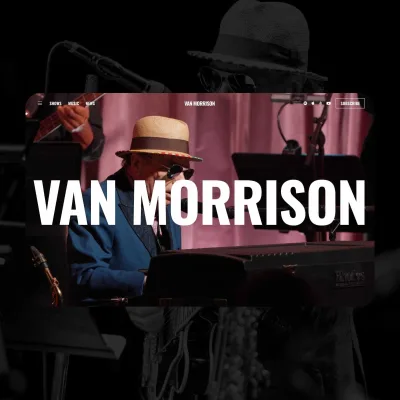
A recent example is the latest website we created for Van Morrison. With a music back catalogue spanning decades, the challenge was making such a huge body of work feel simple to explore. The music section lets users switch between a timeline and grid view, with subtle motion helping them stay oriented as they move through the years.
And occasionally, just occasionally, it can add a moment of genuine personality: a satisfying little flourish when you complete a booking, a logo that resolves nicely the first time the page loads. Delight is a real and worthy goal. It's just that delight has a very short shelf life, which brings us to the trouble with the "wow" animation.
The problem with "wow"
The animations clients ask for most are usually the "wow" kind, the big cinematic intro, the hero section that assembles itself piece by piece, the number that dramatically counts up from zero. And to be fair, they are impressive. The first time.
Delight doesn't survive repetition. Usefulness does.
The trouble is that almost nobody visits a website once. They come back to check something, to finish a task they started yesterday, to find that phone number again. And an animation that delighted them on Monday is something that annoys them by Thursday. That three-second intro you sat through is now three seconds between you and what you came for, and you'll feel every one of them. The counter that ticked up so beautifully is now just a number you have to wait for before you can read it.
Delight doesn't survive repetition. Usefulness does. So when we do build something showy, we're careful about how often it fires, play it once and remember you've seen it, keep it short, and never, ever put it between the user and the thing they came to do.
There's a more stubborn version of this: taking control away from the user. "Scroll-jacking", where scrolling doesn't scroll the page but instead triggers some choreographed sequence at a pace you don't control, is the classic offender. It looks spectacular in a demo and feels like being a passenger in someone else's car. People have their own reading speed, their own reason for being there, and a good site respects that rather than staging a performance around it. You've probably seen this for yourself on Apple's website, showing off their shiny new products and things flying across the screen as you scroll.
The bit most people never think about
Then there's the group of users who almost never come up in the "can we make it pop?" conversation, and absolutely should.
Some people feel genuinely unwell when things move too much on screen. For someone with a vestibular condition, a big parallax effect or a lot of sliding, zooming motion can trigger real dizziness and nausea, the digital equivalent of car-sickness. This isn't a rare edge case you can wave away; it's a meaningful slice of the population, and for them an over-animated site isn't delightful, it's a reason to leave. A big red mark against accessibility.
Devices let people say “I’d rather things didn’t move so much” right in their system settings, and browsers pass that preference along to us as prefers-reduced-motion. A well-built site listens for it and quietly dials the motion back, swapping big movements for simple fades, or turning them off entirely. That is not just good manners, it is what the standard asks for. WCAG 2.2 requires a way to pause or stop anything that moves on its own for more than five seconds, and its criterion on motion triggered by interaction sits at the highest level, AAA. We treat the reduced motion setting as a default rather than an optional extra.
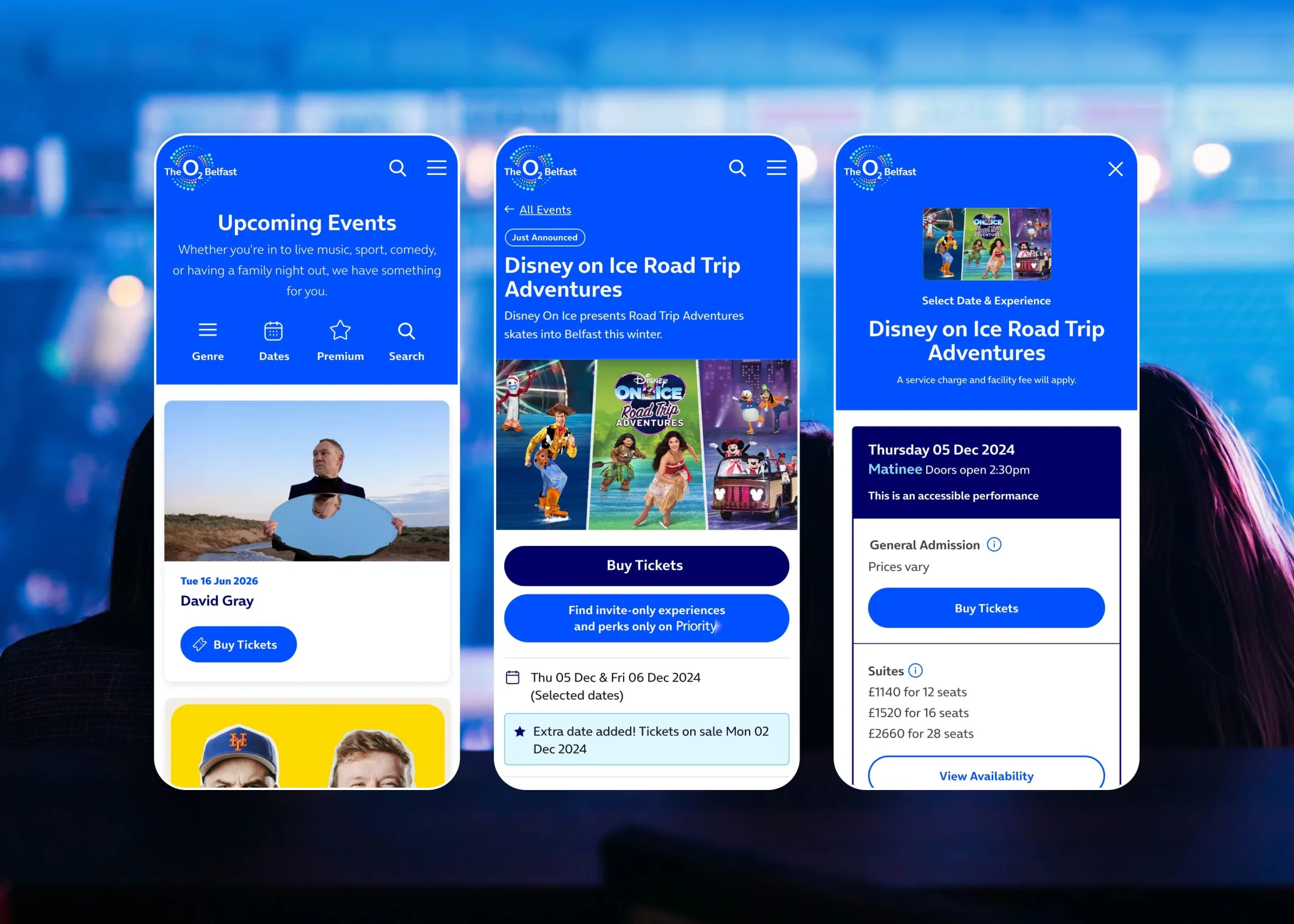
Performance is the other quiet cost. That gorgeous effect running at 60fps on the designer’s brand-new laptop can stutter horribly on a three-year-old phone with fifteen tabs open, which describes a huge number of your actual visitors. Heavy animation also burns battery and, if it’s pulling in big video or image files, data. None of that shows up in the pretty demo. All of it shows up in whether real people enjoy using the thing. The O2 Belfast site has to stay usable on a mobile, which is how more than 85% of its visitors arrive, at the moment a popular show goes on sale and everyone turns up at once. That is the pattern with performance: it matters most at exactly the moment you can least afford it to fail.
Why the good stuff is invisible
Here's the paradox. When animation is done really well, you don't notice it as animation at all. It just feels like the site is behaving the way things should behave.
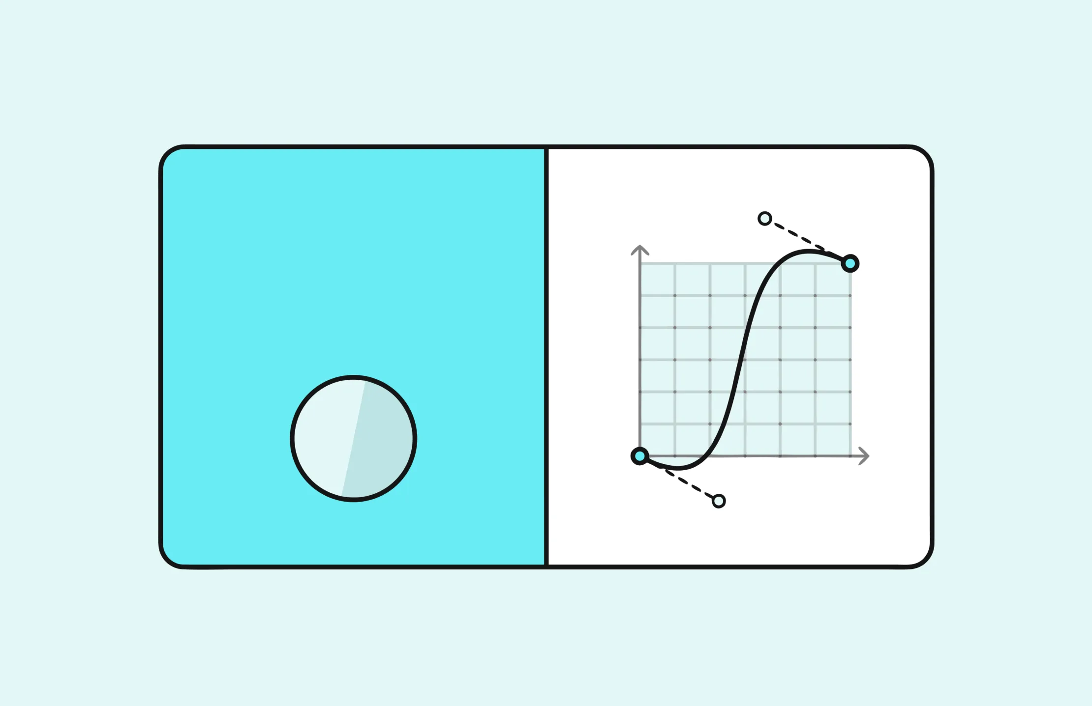
That's not an accident, and it's not the easy path. It's the result of sweating the boring parts, the timing and the easing, which is the technical word for how something speeds up and slows down as it moves. Nothing in the real world starts and stops at a constant speed; a door swings, gathers pace, and eases shut. Your brain knows this, even if you've never thought about it. So when something on screen moves with that same natural rhythm, a touch quicker to get going, softening as it arrives, it slips past unnoticed. Get the easing wrong, make it too fast, too slow, too bouncy, and suddenly the brain flags it. Now you're watching an animation instead of just using a website.
This is the real skill, and it's an unglamorous one. Tools like GSAP will happily let us do almost anything, spin, stagger, morph, choreograph a dozen elements down to the millisecond. The temptation is to use all of it. The craft is in using almost none of it, and spending the effort you saved on making the two or three movements that matter feel absolutely right. A quarter-second here, a slightly softer landing there. It's fiddly and invisible and it's exactly what separates a site that feels expensive from one that feels like it's trying too hard.
Saying no is how we make yes count
So no, we're not anti-animation. We love the stuff. That's precisely why we're so protective of it. When everything moves, nothing means anything; the motion just becomes noise you tune out, like a shop with the music turned up too loud. But when a page is calm and considered, the one moment that does move, the confirmation, the gentle reveal, the small flourish at the finish line, actually lands. It feels intentional, because it is. And sometimes the answer is a straight yes. The Belfast Giants site is built to feel like a matchday, and holding that energy back would have been the wrong call. The difference is that we could say what the movement was doing.
The highest compliment our animation work can get isn't "wow, look at all that movement." It's someone using the site, getting exactly what they came for, and coming away thinking it just felt good to use, without ever being able to point to why.
That's the one they didn't notice. And that's the one we were aiming for all along.
If your site could use less noise and a bit more of that "it just felt good to use" magic, that's exactly where we can help. Get in touch and let's figure it out together.
Let's Talk
Have a digital project in mind? Get in touch to explore how Eyekiller can help bring your vision to life.
Get in touch-
How Designers Are Using AI Tools Responsibly
Here's how our team uses AI to earn back a bit of extra thinking time - and exactly where we draw the line.
-
ChatGPT Ads: Our Honest Verdict
Hear what our Senior PPC Specialist, Matt, has to say about ChatGPT ads.
-
Why your SaaS homepage isn't converting
Hear from Lucy on why most SaaS homepages don't convert, and how to fix yours.